UI Design Patterns for Successful Software course by IxDF
Interaction design course certificate
UI pattern libraries
Page structure
On any page, user always should be able to answer 3 navigation questions:
- Where I am?
- What’s here?
- Where can I go?
Visual frameworks add structure:
- Centre stage moves the focus on what’s important
- Movable pieces support multitasking
- Titled sections helps skim content
- Responsive enabling simplifies tasks by showing everything available and anticipating action, but keeping focus on one part of a task.
Content organization
- Slideshows grab user attention
- Two-panel selectors makes access to content easy
- Lists as scrolling lists, archive lists and list inlays enable searching for items
- Regular and mega dropdown menus displays content the classic way
- Navigation and module tabs allow designers to embrace the mental models of users
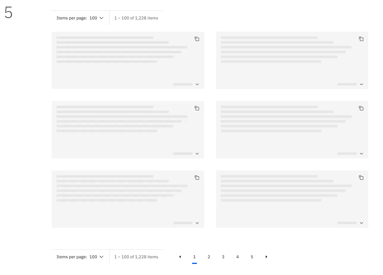
- Pagination splits the content in pages
Fluid navigation
- Global navigation improves website usability
- Breadcrumbs help users retrace their steps
- Search boxes increase efficiency
- Tag clouds surface essential keywords
- Inline linking makes navigation fluid and help users move around with ease
- Sitemap footers keep users going
Data entry
- Autocomplete simplifies data entry
- Editable input fields gives users freedom
- Refined search increases user sense of control
- Forgiving format accomodates user mistakes by offering multiple strategies and helping correct mistakes
- Event calendars speeds up user’s process
- Input hints support users with small clues
Social aspects
- Displaying achievements encourages website usage
- Leaderboards increase competitiveness in users
- Understandable language with the right tone of voice, consistent use of personification and international differences in mind will help set an adequate scene for the interface
- Starred reviews creates a quick overview of opinions
- Imported connections increase efficiency
- Sign-in reminders support extended functionalities
- Update alerts attract users’ attention
Dark Patterns
Dark patterns trick users into accepting things they don’t want or hide compulsory things the business does not want users to find.
- Prioritized advertisements serve the company, not the user
- Beware of harvesting users’ information with forced registration when registration does not provide additional true value to users
- Confusing colors make users feel stupid. Greyed out text, no underline for links, highlighting up-sell more than the main action is highly misleading
- Automatic opt-in forces user agreement without true consent and adds a strain and confusion in the future
- Monthly charge coerces users into a long-term commitment
- Sneaking extra items into shopping baskets trick people into spending more money than they intended (illegal in EU)
- Implied consent is a slippery slope as that removes barriers for a smooth task accomplishment flow, but also can be used to hide important information the user should consent to explicitly (illegal in EU)
Dark patterns should be used sparingly and only when absolutely necessary as they damage brand’s reputation and leave a bad taste in users.
Here is an IxDF take on integrity and twisting ethics:
I will always aim to balance my users’ needs with my clients’ commercial interests. I understand that some dark patterns have appropriate uses, but I will leverage them responsibly, and with a careful eye on how users are likely to react.
Exercises
Page navigation: Where, What and Where to in Their.tube
Task
Jeff Veen, founding partner of user experience consulting group Adaptive Path, suggests web users have three questions when they arrive at a site: ‘Where am I?’, ‘What’s here?’, and ‘Where can I go?’. Please choose an example of a webpage you like and outline how a visual hierarchy is – or should be – used here, to answer these questions properly.
My answer
A small project webpage I really adore is their.tube. It has a rather clean, but quirky design and does the job of answering the 3 ‘W’ questions very well.
This project heavily uses “navigation through content”, because all “Where can I go?” options are not just text labels, but also have a visual that gives user a feeling what kind of content to expect when opening any of them.
Visually, the answer to “Where I am” is the most prominent element and the main content (all persona illustrations “Where can I go?”) - the next.
If we open any inner page, we see that it keeps the simple design and style and also uses YouTube’s design pattern at the same time making sure user understands he is not in YouTube.
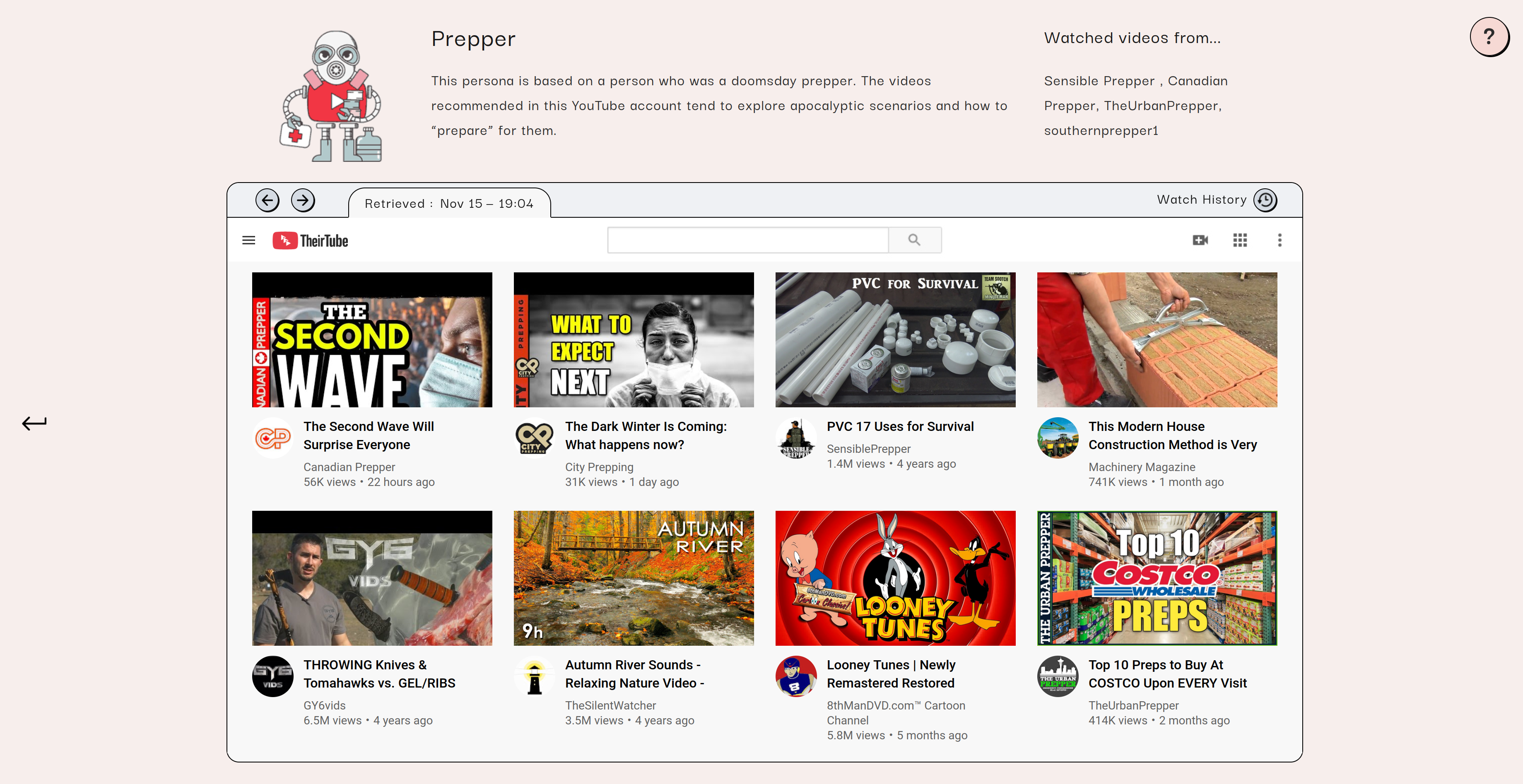
Visually, the “Where I am” is the first thing user will notice because of being in the upper part and with a title. Next, the videos (“Where can I go?” & “What’s here?”) are put in a clear grid and will take the most attention (first - image, afterwads - title). Again, “navigation through content” it is!
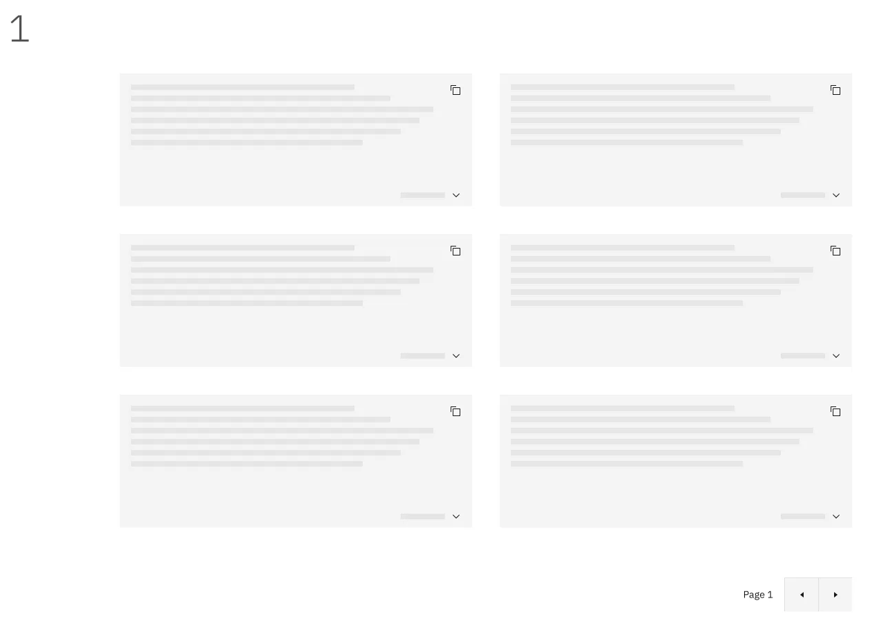
Pagination exercise
Sketch a set of five different ways to visualize the pagination design pattern for a web shop, and describe which one is your favorite and why.
1) Simple
The most simple pagination ever. Good if you have a few pages, but bad for a lot of content, because it violates few of the best practices by being restrictive - it does not give full control and doe snot provide full information to users and slows down their interaction
2) More advanced
A more advanced option that includes all of the good practices. I also added to the basic components Previous and Next page buttons for easier navigation:
3) All good practices
This includes all the good practices (practically the same as no.2, only without previous/next). Just as in no. 2, I included this pagination in the top and the bottom of the page to make it is easier to change the items per page at the beginning.
4) Basic pagination
Another basic pagination: it includes few of the previous and next pages and shows in which page you are right now. It is good for showing at which page you have been already (it is possible to color code the seen ones).

5) Items per page pagination
This is practically the same as no.4, only with added option to choose Items per page.
My favourites
I prefer No. 4 for simple UIs that don’t have tons of content and No. 2 for more complex cases that can benefit from all best practices - where users might appreciate the added flexibility and big buttons of previous/next.
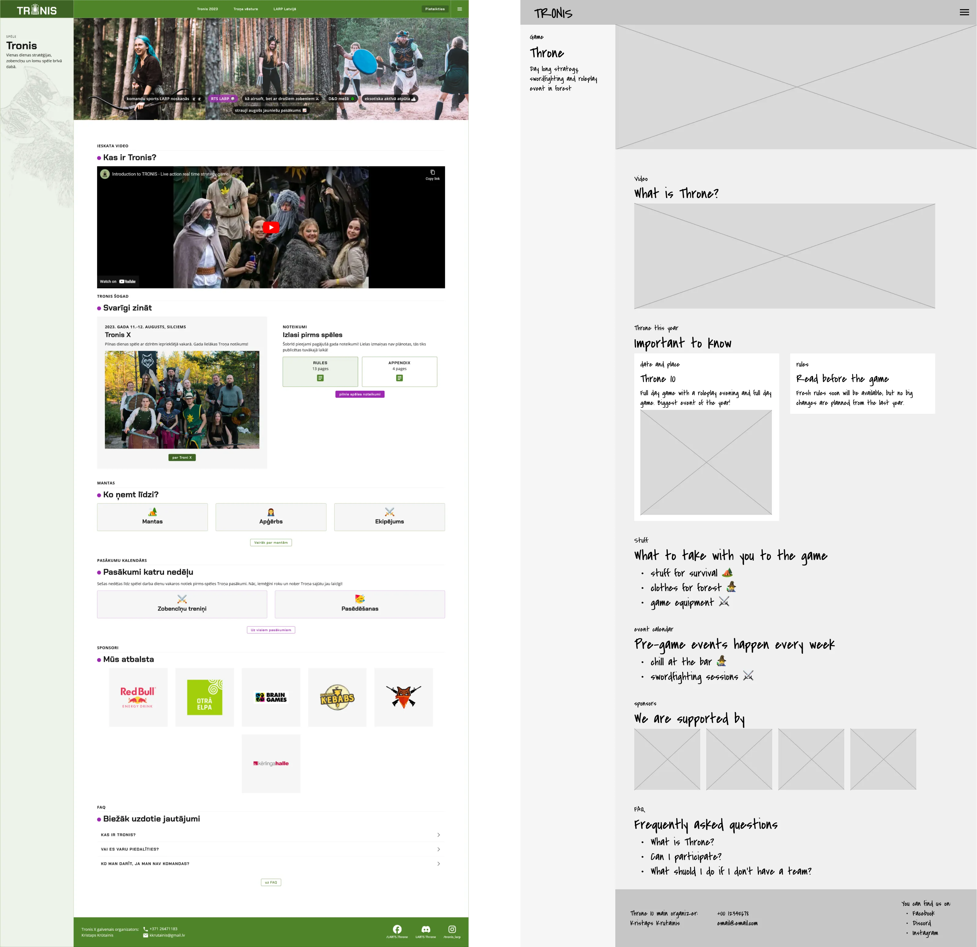
Remove fluid navigation: stripped down Tronis
Task
Pick a website and do something that may seem strange at first: sketch how this website would look, if you stripped away the most prominent design patterns that afford fluid navigation.
Determine the main task that a user will need to perform when visiting this website. Make sure this task is attainable, even though you’re not using the main design patterns anymore. Make a simple paper prototype with which you can let a person experience this task. Borrow five minutes of time from a friend, colleague, or ignorant passer-by, and ask them to perform the task with your paper prototype. Now analyze the experience they had and write down what you’ve learned.
Setup
For this task I used a website I created for a hobby project - real life action game Throne. It has two main audiences and each has a main task:
- potential players: learn about the event; no previous experience
- returning players: register for the game
I made a stripped down prototype that excludes any interactions on the page (links, buttons, etc). Users could achieve the registering task only through the main navigation.
I tested it with 1 person in both audience roles.
Results
- Feeling frustrated
My user felt frustrated mainly because:
- clicks did not resulting in action. Nothing happened
- had to go the long way through main navigation, even the context info is right in front of them. It seemed counterintuitive.
There is a CTA (call to action) and no action for me to take? What is this? I’’ll get lost on my way!
/User quote
- Copy matters
After the test explaining the task, user noted an important note:
This approach may work if the copy would be completely different, but in the usual way this suggests that something is broken.
The website is built with the most common information consuming patterns in mind - skimming, linking to more info, etc. Stripping away only the links breaks it, but taking more conservative approach of “making a book online” might actually work.
Conclusions
- Such an approach adds extra mental load to get to the desired place. User can easily forget what they wanted to accomplish and leave without a result. A real life example: you go to a different room to do a task, but when entering, forget why you came there.
- Taking away fluid navigation patterns breaks the page because it’s the fundamental building block of this particular page. There might be occasions where such a “book-like” way is useful and fits in well.